Welcome to the Inedo Forums! Check out the Forums Guide for help getting started.
If you are experiencing any issues with the forum software, please visit the Contact Form on our website and let us know!
BuildMaster Pipeline Stage View
-
Hi Support,
Can anything be done to improve the view of the pipeline stages once you have more than one row please ?
I get what its trying to do, but it looks like Stage 5 is connected to Stage 1 !
Thanks,
Paul
-
Hi @paul-reeves_6112,
Thanks for bringing this up to us. Let me see what I can do about that. Quick question though, when you shrink the window, is it still 4 and 5 that have the issue or does it start shifting the problem down?
Thanks,
Rich
-
@rhessinger
Hi Rich,
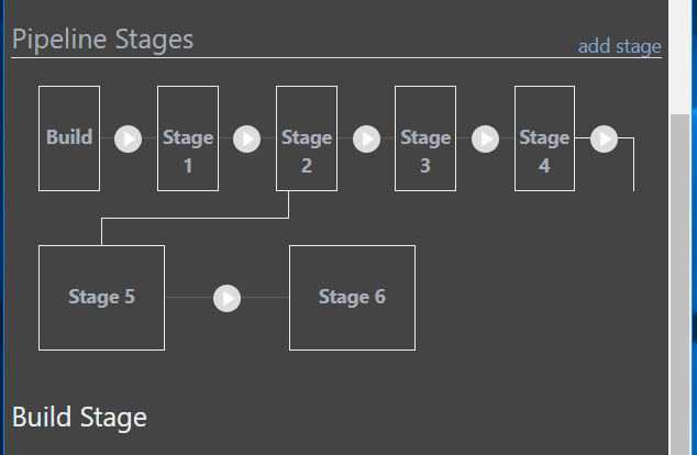
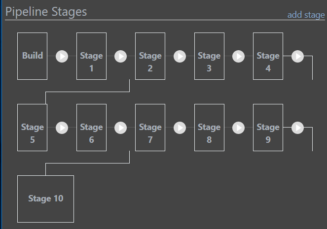
Shrinking the width, it seems as though its hardcoded to 5 stages per row, as it just squashes the width of the first row of stages.
This is the minim width I can make the window :

This behaviour does seem consistent across multiple rows :

Thanks,
Paul
-
Hi @paul-reeves_6112,
Thanks for checking this for me. I was able to get this resolved and it will be released later this week in BuildMaster 7.0.6.
Thanks,
Rich
-
Hi @rhessinger,
Excellent news, thank you.Regards,
Paul
-
Hi @rhessinger ,
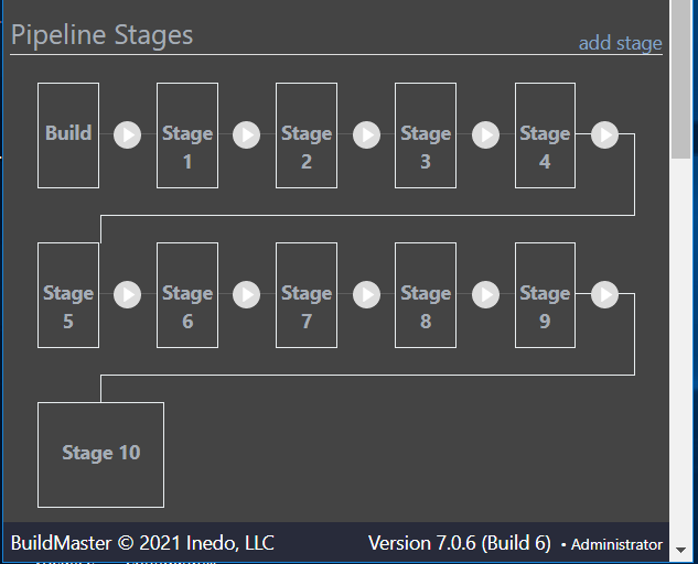
Thank you, 7.0.6 looks much better !

Accepting this is an edge case; but the top of the line into the 2nd row does not stay centred on the stage box as you resize the width :

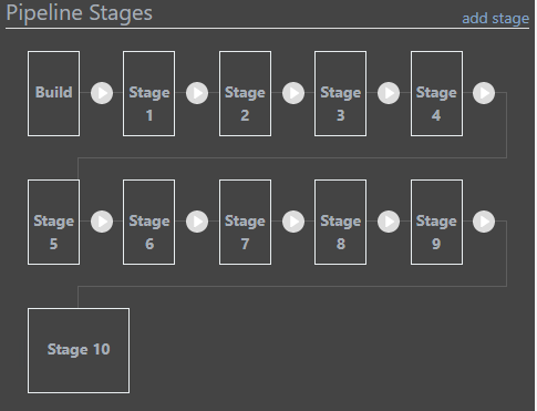
Also OCD coming up..now this is fixed I've noticed the cross row link line is 'solid white' {the same as the box edge} versus the one within the row which appears more 'grey' .. can the styling be updated to match ?
Thanks,
Paul
-
Hi @paul-reeves_6112,
Thanks for taking a look. I corrected the color and improved the spacing in BuildMaster 7.0.7.
Thanks,
Rich
-
-
Hi @paul-reeves_6112,
Thanks! Always happy to help. Please let us know if you find anything else!
Thanks,
Rich
